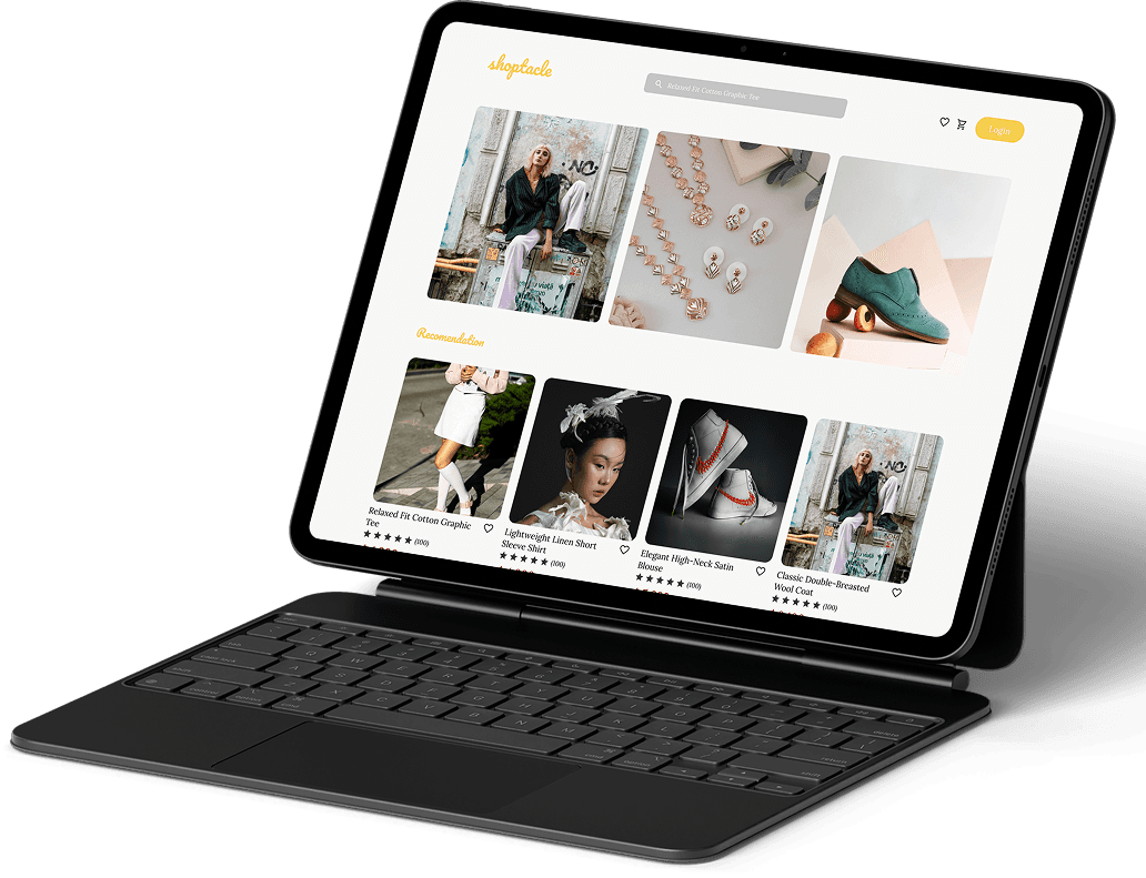

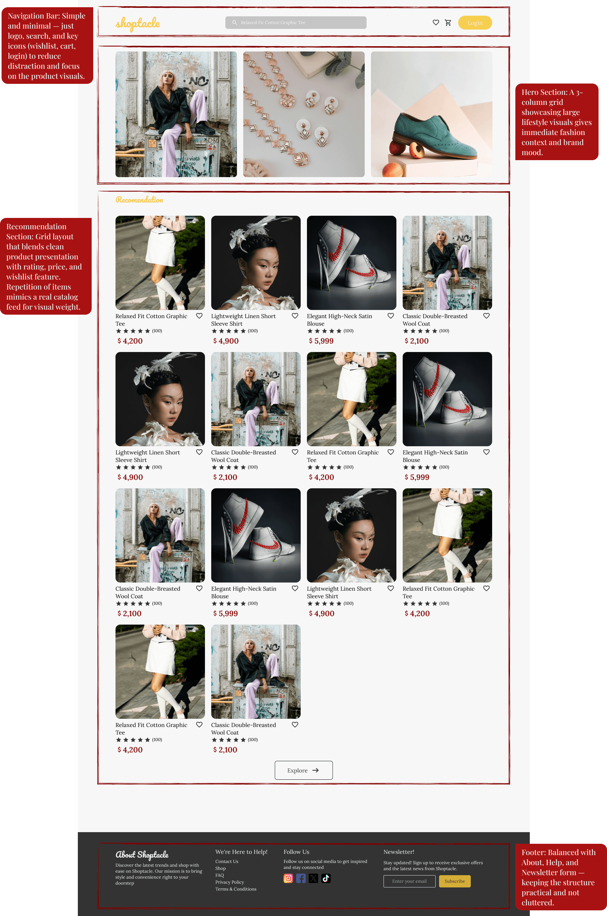
🛒 Overview
Shoptacle is a fictional e-commerce platform I designed to practice clean UI and conversion-focused layouts. This project challenged me to create a landing page that feels modern, minimal, and trustworthy — all without overwhelming the user.
My focus was on structure, visual clarity, and guiding first-time visitors toward key actions like product discovery or sign-up.

🎯 Goal & Target
Shoptacle was created to bring the charm of curated, boutique-style shopping into the digital space. The goal is to make browsing feel intentional and aesthetic, not overwhelming.
Our primary audience is young adults who seek unique, design-forward products—and who value a personalized, visually-pleasing shopping experience.

🧠 What I Learned
Designing Shoptacle’s landing page helped me sharpen my visual storytelling skills. Even though it was a single-page design, I learned how to structure content that feels engaging, communicates clearly, and reflects the brand’s identity through typography, colors, and layout choices. It taught me that a strong landing page doesn't need to be complex—as long as it’s thoughtful.


