
💡 Overview
This redesign project focuses on enhancing the overall user experience of the Pizza Hut app by introducing a more intuitive interface, faster performance, and updated visual elements. The goal is not only to streamline the ordering process but also to integrate new features such as digital payments and loyalty rewards. By doing so, the revamped experience aims to boost customer satisfaction, encourage repeat orders, and reinforce Pizza Hut’s position as a modern, user-centric food service brand.

🎯 Design Process
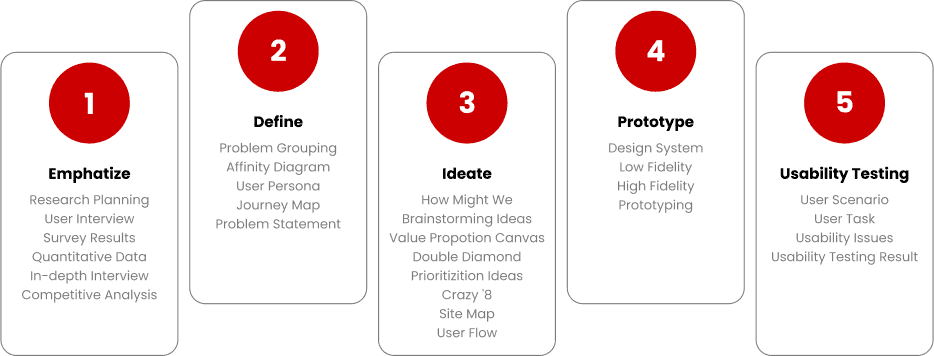

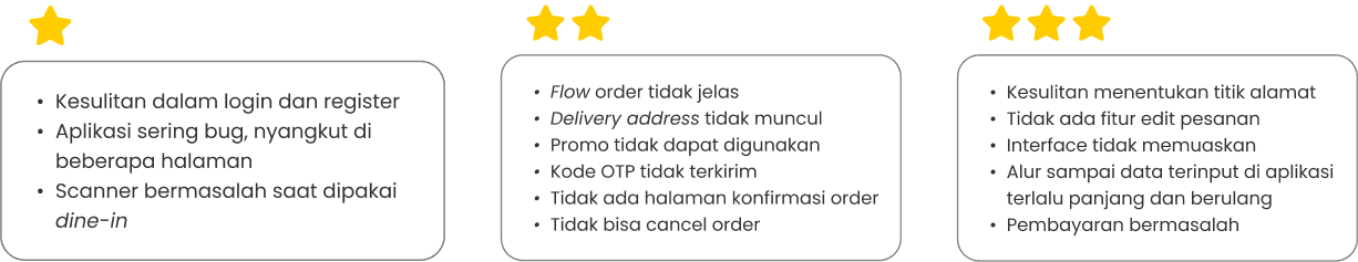
In-Depth Interview Result Summary

Tidak dapat merubah metode pembayaran
Tidak ada tombol cancel
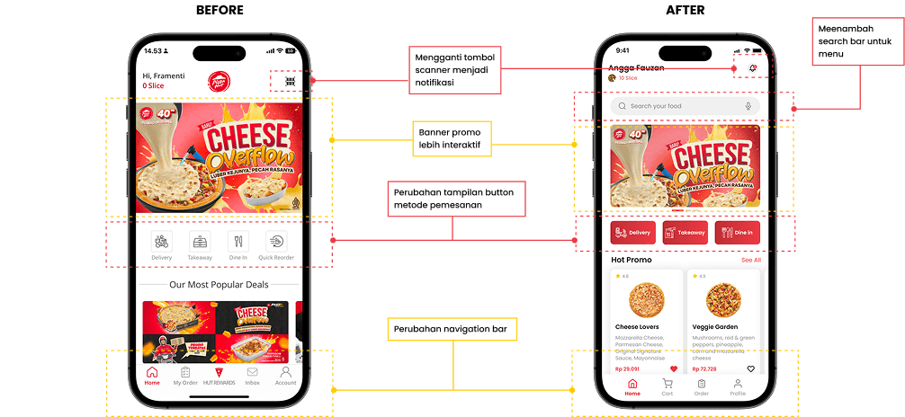
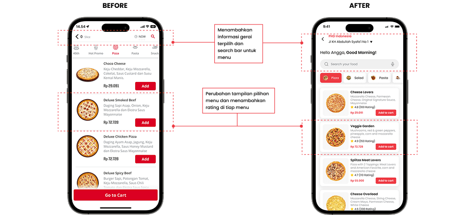
Gambar produk pada menu terlalu kecil
Tampilan kurang menarik
Tulisan pada deskripsi produk terlalu abu-abu dan kurang jelas

Banner tidak bisa diklik/diarahkan ke menu promo
Tidak ada fitur review order
Tidak ada pemberitahuan kalau gerai tidak dapat melakukan delivery sehingga harus mengulang pemesanan
Online Listening
(Appstore & Playstore Reviews)
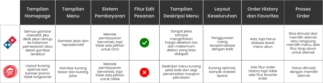
Competitive Analysis

Affinity Diagram
Based on research with users that we have done, there are several pain points felt by users. These pain points often make users run out of time.
Therefore, we group paint points into affinity diagrams so that potential problems that users often face can be assessed.
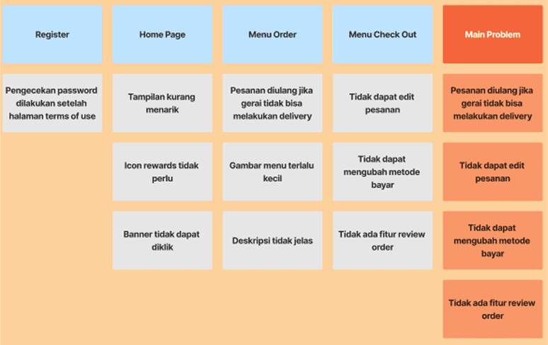
Problem Statement
A user found the application visually unappealing and experienced many difficulties from the registration process, understanding the information presented, to the entire purchase process. Users also faced obstacles such as not being able to review orders before payment. Therefore, the application needs to be changed to be more attractive and easier for users in these various aspects.
Grouping by Similarity Context
User Interface
The menu image is too small
Unclear description writing
Unattractive display
Banners that cannot be redirected to the promo menu
The rewards icon is not needed
User Experience
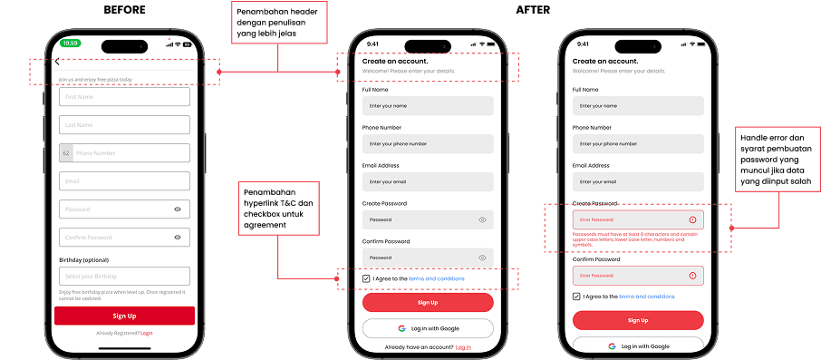
Password checking after the terms of use page
Unable to change payment method
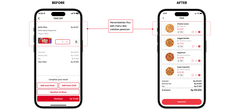
No review order feature
No order editing feature
No prior notice about unavailable delivery

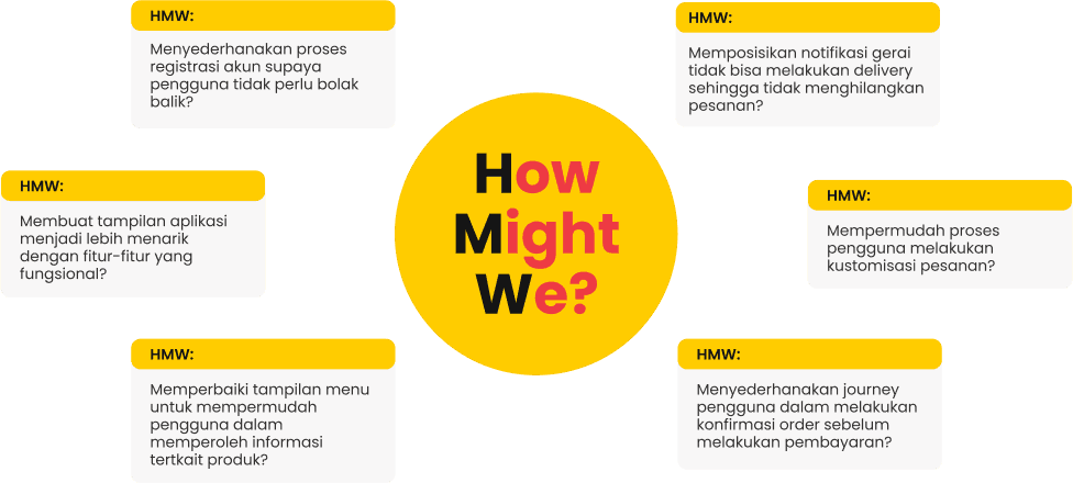
Crazy 8
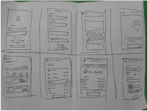
Wireframe
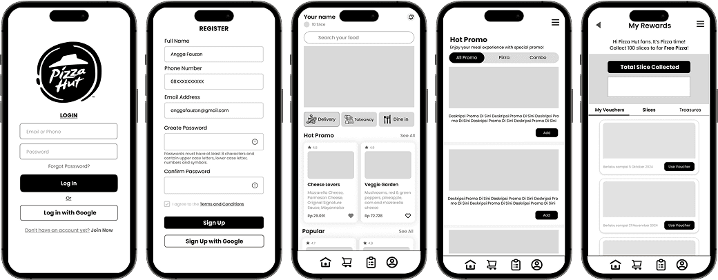
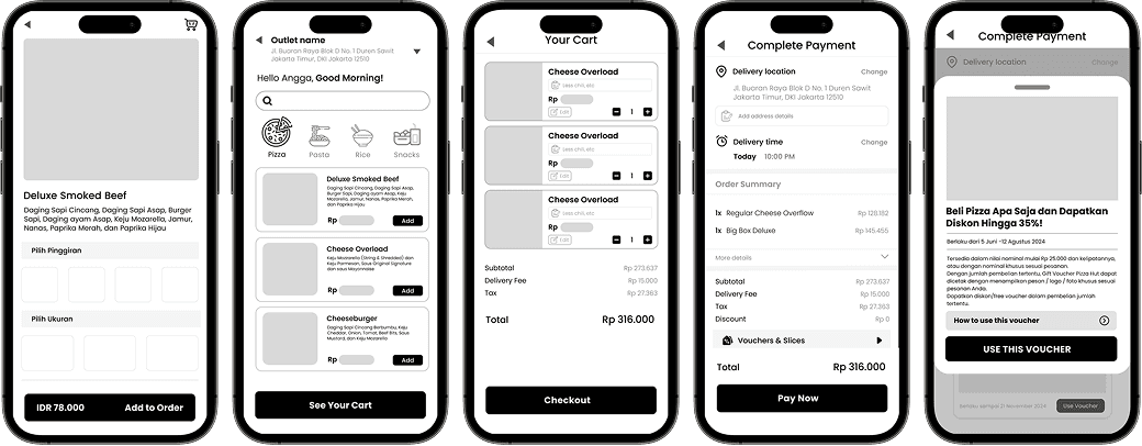
Design High Fidelity

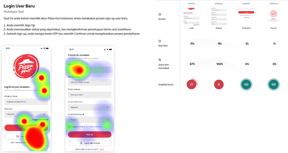
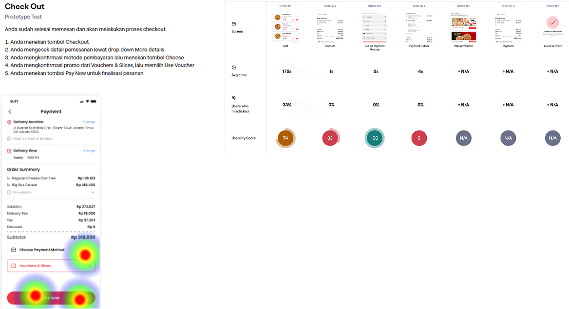
Usability Testing Block 1
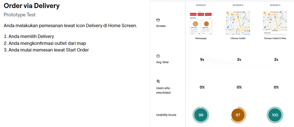
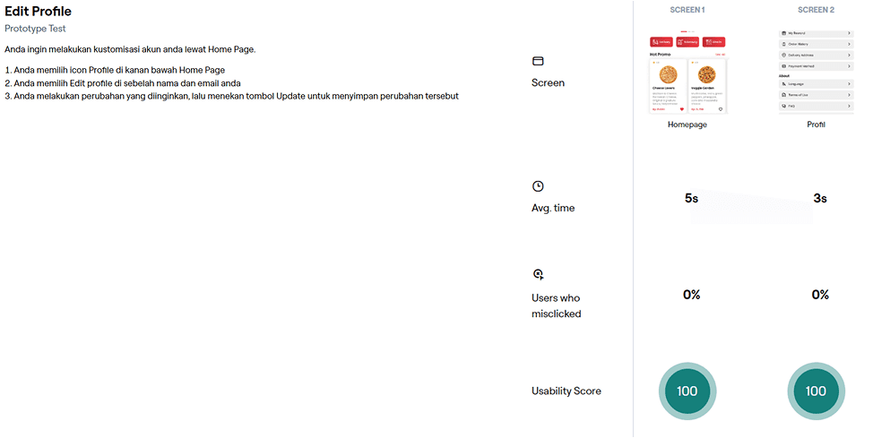
Usability Testing Block 2

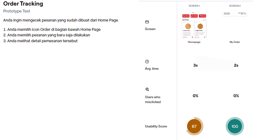
Usability Testing Block 3
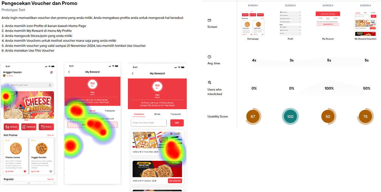
Usability Testing Block 4
Usability Testing Block 5
Usability Testing Block 6
Usability Testing Block 7
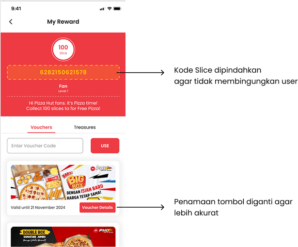
Modifikasi Setelah UT
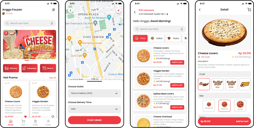
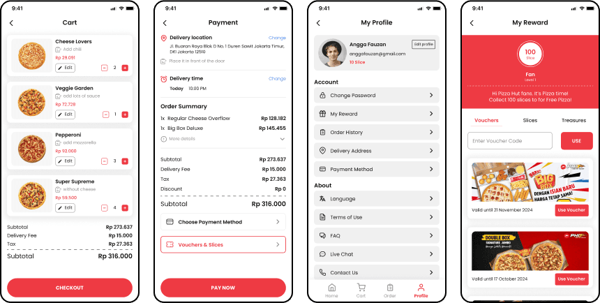
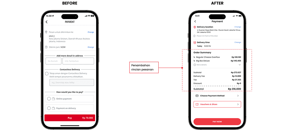
Before
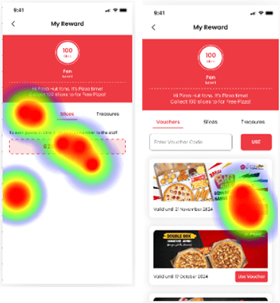
After

🧠 What I Learned
Project ini jadi salah satu pengalaman yang bikin aku lebih percaya diri dalam menerapkan prinsip UI/UX secara menyeluruh. Lewat redesign aplikasi Pizza Hut, aku belajar bagaimana merancang flow pemesanan yang lebih efisien, memperbaiki hierarki visual, dan mengoptimalkan pengalaman pengguna pada platform yang sudah familiar bagi banyak orang. Tantangannya ada pada menjaga identitas brand sambil tetap membuat tampilan dan navigasi terasa lebih modern dan nyaman. Project ini juga ngelatih aku dalam menyeimbangkan kebutuhan bisnis dengan kebutuhan pengguna.


